
Short answer: to make a website mobile friendly, add a viewport meta tag, use a responsive layout that stacks into one column on small screens, set body text to at least 16px, make buttons and links at least 48px tall with space between them, simplify the menu, compress images, remove pop-ups that cover the page, and test on real phones and in Google PageSpeed Insights. Most websites need a handful of these fixes, not a full rebuild.
Most visitors in Pakistan open websites on their phones, and Google ranks sites based on their mobile version. Our web design team in Karachi builds every site mobile-first, and this checklist is the one we use to fix other sites too. It works for WordPress, Shopify, Wix and hand-coded websites.
Chapter 01
Why a Mobile Friendly Website Matters
A mobile friendly website is one that’s easy to read and use on a phone without zooming, pinching or sideways scrolling. It matters for three reasons:
- Google indexes the mobile version. With Google’s mobile-first indexing documentation, Google uses the mobile version of your pages for ranking. If content or links are missing on mobile, Google doesn’t see them.
- Most of your visitors are on phones. For many Pakistani businesses, especially those advertising on Instagram, Facebook and TikTok, almost all traffic comes from mobile.
- Mobile visitors leave quickly. If a page is slow or hard to tap, they go back and pick a competitor.
A site that isn’t mobile friendly loses rankings, leads and sales, often without the owner noticing, because they check it on a laptop.
Chapter 02
How to Test If Your Website Is Mobile Friendly
Google retired its old Mobile-Friendly Test tool and Search Console’s Mobile Usability report in December 2023, so use these instead:
- Your own phone. Open your key pages on an Android phone and an iPhone if you can. Try to read, tap the menu, fill a form and buy something.
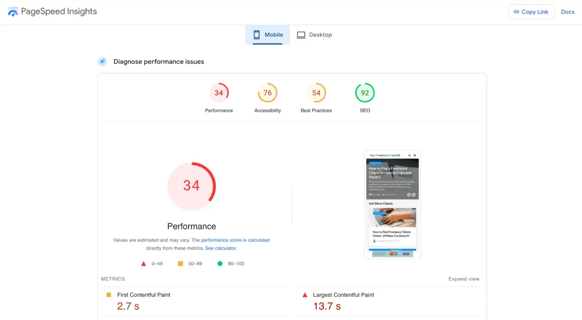
- Google PageSpeed Insights. Paste your URL and check the mobile tab: performance score, Core Web Vitals and the Lighthouse warnings.
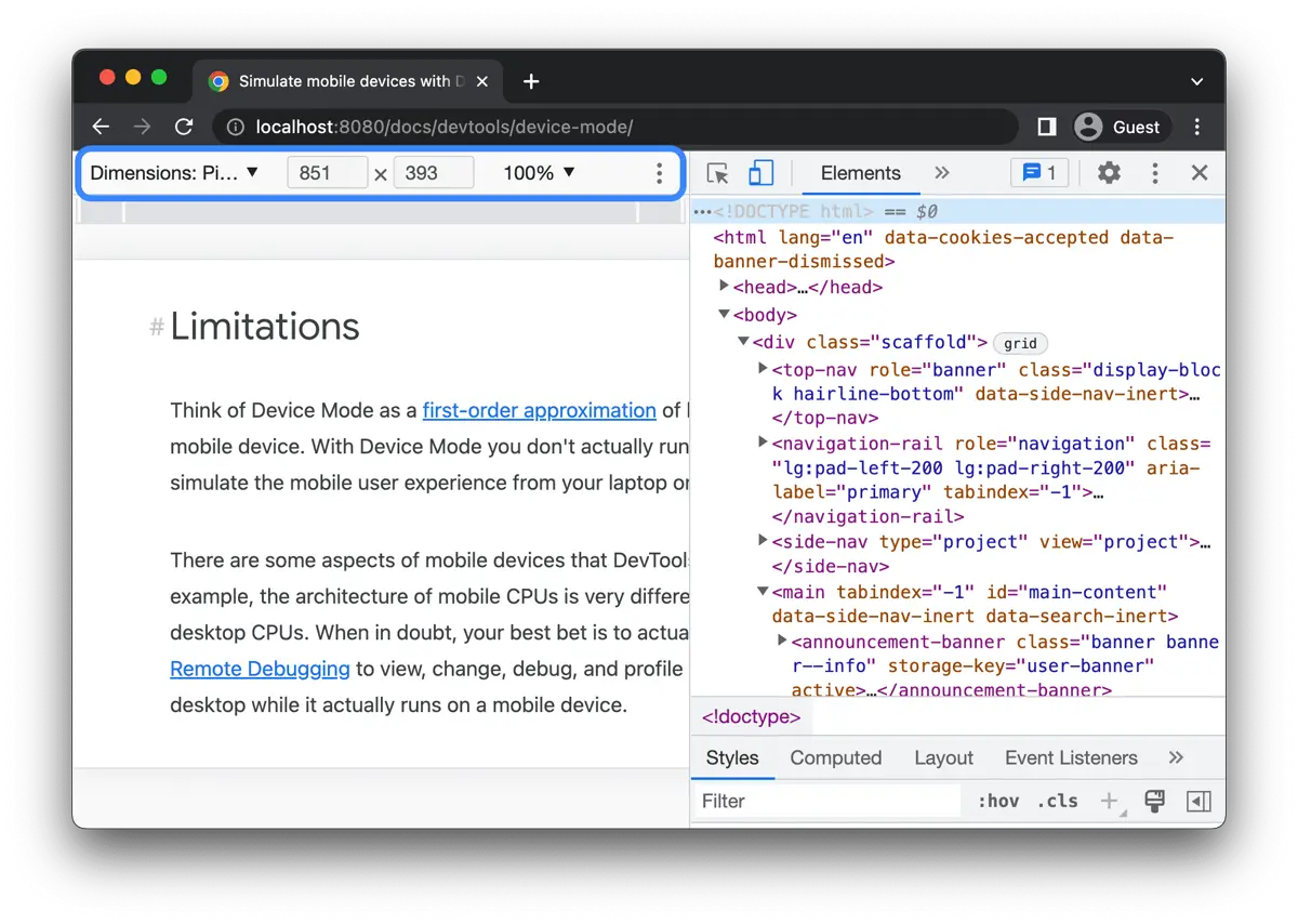
- Chrome DevTools. On a laptop, press F12, then the phone icon, to see your site at any screen size.
- Search Console’s Core Web Vitals report for the mobile experience across your whole site, based on real visitors.
Write down every problem you find, then work through the 12 fixes below, in order. They start with the quickest wins.
Chapter 03
Add the Viewport Meta Tag
Without a viewport tag, phones show a shrunken desktop page that visitors have to zoom. This one line in the page’s <head> fixes it:
<meta name="viewport" content="width=device-width, initial-scale=1">
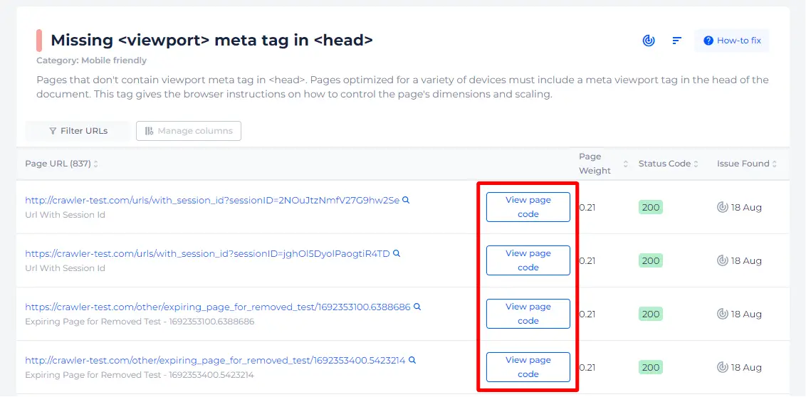
Modern WordPress and Shopify themes include it already. Older custom sites and some page builders don’t, so check the page source.
Chapter 04
Use a Responsive Layout
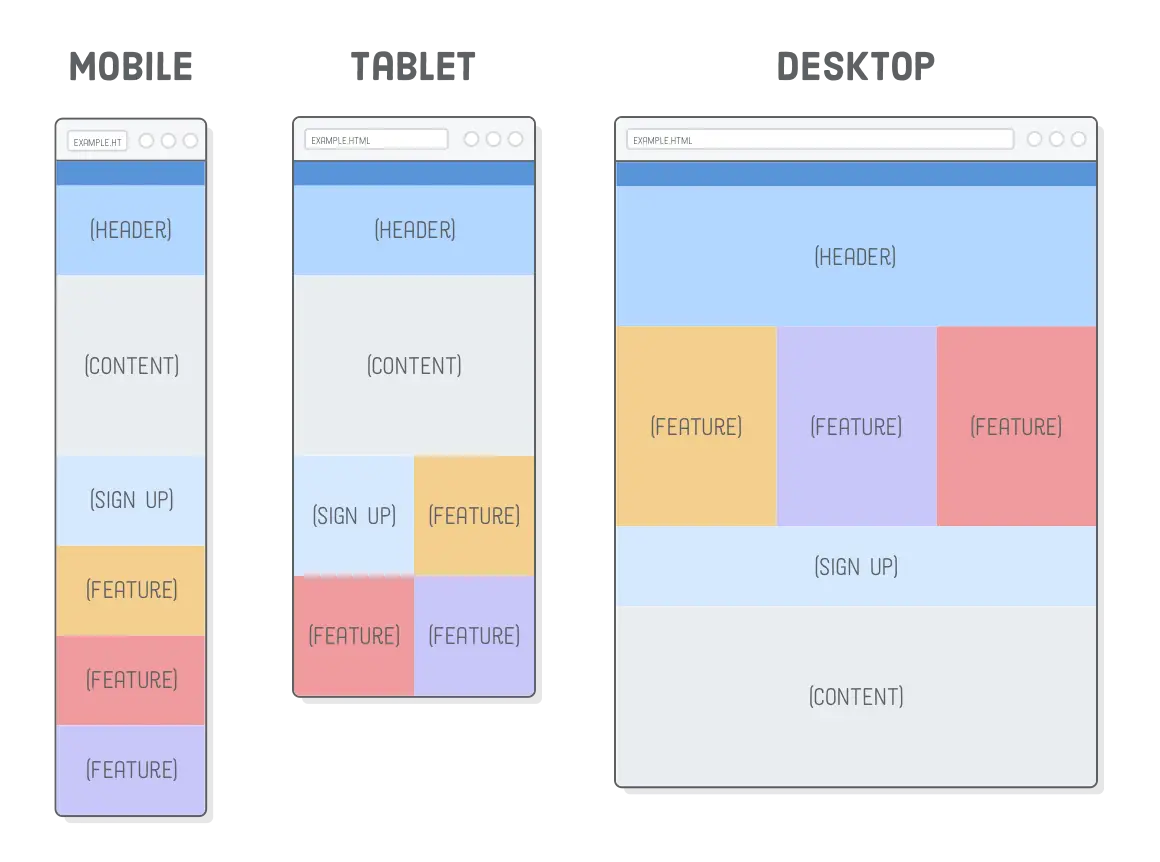
Responsive design means the same page rearranges itself for each screen size: three columns on desktop can become two on a tablet and one on a phone. It’s done with CSS media queries and flexible grids, not a separate mobile site.
On WordPress, choose a responsive theme and check each section’s mobile settings in your page builder. On Shopify, almost all themes in the Theme Store are responsive. If your site was built years ago with fixed widths, a redesign may be cheaper than patching every page.
Chapter 05
Make Text Readable Without Zooming
- Body text at least 16px.
- Line height around 1.5, so lines don’t run into each other.
- Short paragraphs of two to four lines on a phone.
- Strong contrast: dark text on a light background, not light grey on white.
Urdu text usually needs a slightly larger size and more line height than English to stay readable.
Chapter 06
Make Buttons and Links Easy to Tap
Fingers are less precise than a mouse. Google’s Lighthouse checks that tap targets are at least 48 by 48 pixels with space around them, so visitors don’t hit the wrong link.
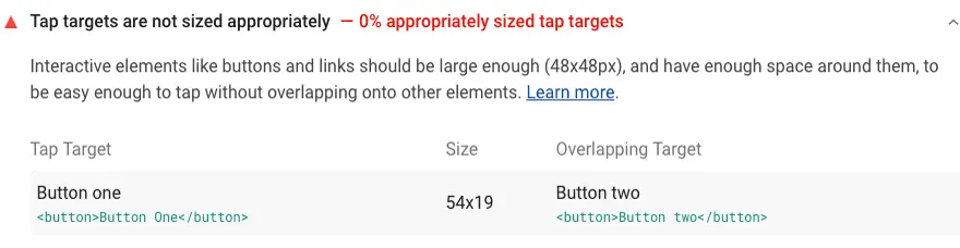
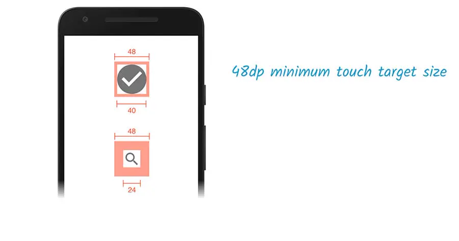
Pay special attention to menu links, footer links, social icons and the “Add to cart” and “WhatsApp” buttons. These are the ones that make you money.
Chapter 08
Compress and Resize Images
Large images are the most common reason mobile pages are slow. Fix them by:
- Saving photos as WebP and resizing them to the size they’re actually shown.
- Serving smaller images to phones with
srcset(WordPress and Shopify do this automatically). - Lazy-loading images below the fold, but not the main image at the top of the page.
On our own homepage, compressing images, loading the main image first and cutting unused code took the mobile PageSpeed score from 53–66 to 94–97.
Chapter 09
Remove Pop-Ups That Cover the Page
A pop-up that covers the whole screen as soon as a visitor arrives is hard to close on a phone and annoys visitors. If you need a pop-up for a sale or newsletter, show it after a delay or on exit, keep it small, and make the close button large and obvious. Cookie and legal notices are fine as small banners.
Chapter 10
Make Forms Quick to Fill
- Ask only for what you need: name, phone and message are often enough.
- Use the right input types (
telfor phone,emailfor email) so the right keyboard opens. - Labels above the fields, not inside them, so they don’t disappear while typing.
- A large submit button and a clear success message.
Chapter 11
Add Click-To-Call and WhatsApp
On a phone, calling or messaging is easier than filling a form. Make your phone number a tap-to-call link and add a WhatsApp button, ideally fixed at the bottom of the screen on mobile. For Pakistani businesses, this one change often brings more leads than everything else on this list.
Chapter 12
Make It Fast: Core Web Vitals
Speed is part of being mobile friendly. Google’s Core Web Vitals (web.dev) measure how fast the main content appears (LCP), how quickly the page responds to taps (INP) and whether things jump around while loading (CLS).
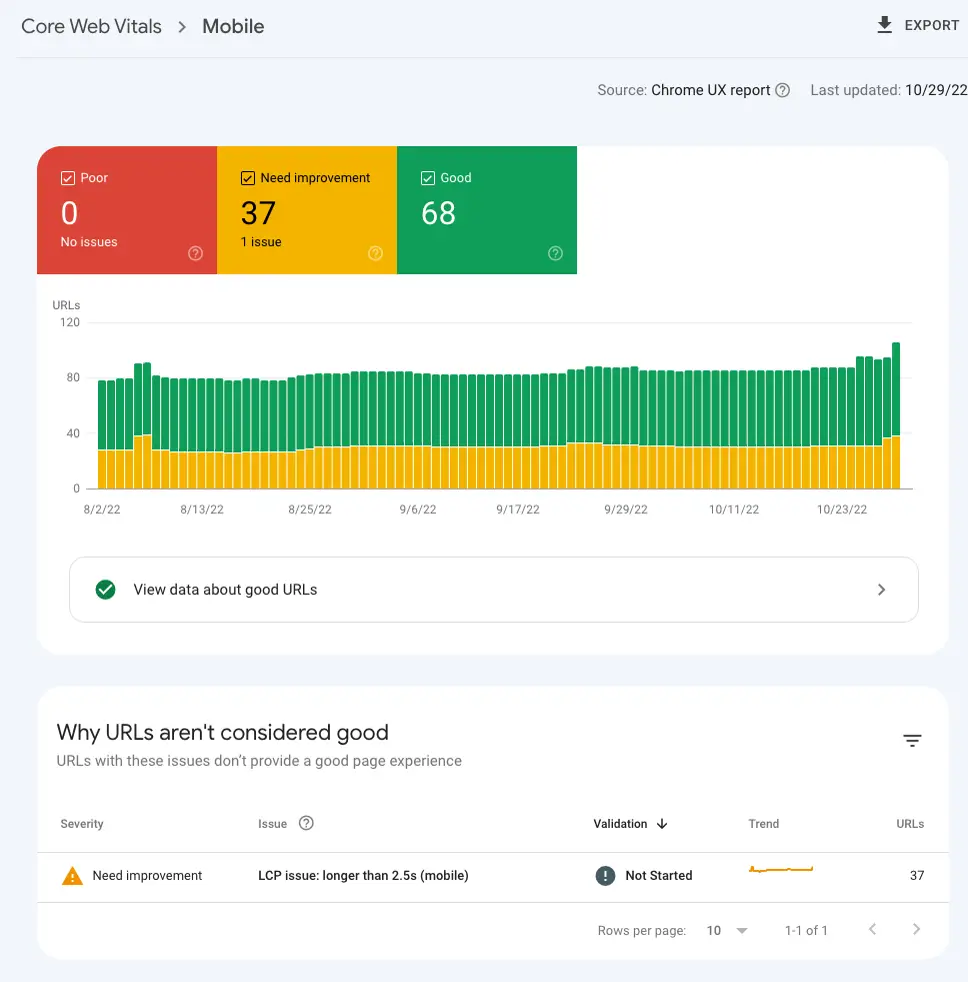
The biggest wins are usually good hosting, caching, compressed images, fewer plugins or apps, and fonts that load quickly. If your WordPress site is slow, our WordPress speed optimization service handles this end to end.
Chapter 13
Handle Tables, Videos and Wide Content
Wide tables and embedded content are a common cause of sideways scrolling. Wrap tables so they scroll inside their own box, or turn them into stacked cards on mobile. Make videos and maps responsive with a width of 100%. Check every page for anything wider than the screen; in DevTools, a horizontal scrollbar at phone size is the giveaway.
Chapter 14
Test on Real Devices After Every Change
Emulators are useful, but nothing replaces a real phone. Test on at least one budget Android phone, because that’s what many of your visitors use, on mobile data, not just office Wi-Fi. Re-test after every theme, plugin or design change.
Chapter 15
How to Make a Website Mobile Friendly: The Quick Checklist
| Check | Good | Fix if |
|---|---|---|
| Viewport meta tag | Present on every page | Page looks shrunk on a phone |
| Layout | One column on phones, no sideways scroll | Content cut off or tiny |
| Text | 16px+, good contrast | You need to zoom to read |
| Buttons and links | 48px+, spaced out | You tap the wrong thing |
| Menu | Clear menu button, 5–7 items | Menu overflows or needs hover |
| Images | WebP, resized, main image loads first | PageSpeed flags image size |
| Pop-ups | Small, delayed, easy to close | Covers the page on arrival |
| Forms | Few fields, right keyboards | Typing is slow or confusing |
| Contact | Tap-to-call and WhatsApp | Only a long form |
| Speed | Mobile PageSpeed in the green | Score under 50 |
Chapter 16
How to Make a Website Mobile Friendly on WordPress, Shopify and Wix
- WordPress: use a responsive theme, check each page builder section’s mobile view, and add a caching plugin. Remove plugins you don’t use.
- Shopify: use a Theme Store theme, preview on mobile in the theme editor, and keep apps to the essentials.
- Wix and other builders: edit the mobile view separately, because changes on desktop don’t always carry over.
If you’re choosing a platform, our website builder in Pakistan guide compares them, including how well each handles mobile.
Chapter 17
Common Mobile Mistakes on Pakistani Websites
When businesses ask us to make a website mobile friendly, the same problems come up again and again:
- A huge slider at the top. Three or four full-width banner images load before anything else, so the phone shows a blank screen on mobile data. One fast image with a clear headline works better.
- The WhatsApp button covers other buttons. A floating chat button is useful, but place it so it doesn’t sit on top of “Add to cart” or the menu.
- Prices and phone numbers in images. Text inside images can’t be tapped, copied or read by Google, and it’s often too small on a phone. Put them in real text.
- Desktop-only content. Some page builders hide sections on mobile. With mobile-first indexing, hidden content may not count, so show the same content on every device.
- Too many plugins or apps. Each one adds code that a budget phone has to load. Remove what you don’t use.
- Untested Urdu or mixed-language text. Urdu fonts can overflow buttons and boxes. Check every page that uses them on a real phone.
Fixing these usually takes far less time than a redesign, and they are the first things to check if you want to make a website mobile friendly quickly.
Chapter 18
How Long Does It Take to Make a Website Mobile Friendly?
It depends on how the site was built. A modern theme with a few problems can often be fixed in a day or two: the viewport, text sizes, buttons, images and pop-ups. A large site with many custom page layouts takes longer, because each template has to be checked and fixed. An old site with fixed widths is often quicker to rebuild than to repair.
Whichever route you take, measure before and after with PageSpeed Insights and a real phone, so you know the work actually helped.
Chapter 19
When to Fix It, and When to Redesign
If your site uses a modern theme and has a few problems, fix them one by one with this list. If the site was built with fixed widths, uses an old page builder, or scores under 30 on mobile PageSpeed, a mobile-first redesign is usually faster and cheaper than patching every page. When you compare quotes, our guide on how to choose a web design company shows what to check, including testing their own sites on mobile.
Website Services Pakistan (WSP) has built 450+ websites since 2014 from Tariq Road, Karachi, all mobile-first, with no advance payment: you pay once the website is finished. See our web design in Karachi service or custom web development.
FAQ
FAQ
How do I make my website mobile friendly?
Add a viewport meta tag, use a responsive layout, set text to at least 16px, make buttons at least 48px with space between them, simplify the menu, compress images, remove full-screen pop-ups, shorten forms, add tap-to-call and WhatsApp, improve speed and test on real phones.
How can I check if my website is mobile friendly?
Open it on your own phone, test it in Google PageSpeed Insights on the mobile tab, view it at phone size in Chrome DevTools, and check the Core Web Vitals report in Search Console. Google retired its separate Mobile-Friendly Test in December 2023.
What is responsive design?
A way of building websites so the same page rearranges itself for each screen size, for example three columns on desktop and one column on a phone, using flexible layouts and CSS media queries.
Does a mobile friendly website help SEO?
Yes. Google uses the mobile version of your pages for indexing and ranking (mobile-first indexing), and page experience on mobile, including speed, affects how visitors and Google see your site.
How much does it cost to make a website mobile friendly?
Small fixes such as the viewport tag, text sizes and button sizes can be quick. Sites built with fixed widths or old page builders usually need a mobile-first redesign, which is quoted on the number of pages and features.